
Swap spreads are excellent leading indicators of economic health, as the above chart demonstrates. (Here is a primer on swap spreads.) Swap spreads can be thought of as the price that market participants must pay to reduce their exposure to risk. When swap spreads rise, it's because investors are becoming more worried about the future, the market is becoming more risk averse, liquidity is drying up, and/or the economic fundamentals are deteriorating. As a result, it becomes more expensive to get rid of unwanted risk. Swap spreads have risen in advance of the last three recessions, and they have declined in advance of the last two recoveries. The decline in swap spreads in late 2008 led me to predict improving conditions in 2009. Today, swap spreads are about as low as they get, and that suggests that systemic risk in general is very low, and therefore the health of the economy is likely to improve over the next six months.

Systemic risk has declined significantly. To judge by the decline in Eurozone swap spreads, conditions in the Eurozone have improved dramatically so far this year. This reflects serious efforts on the part of the ECB to improve liquidity conditions. When markets are liquid, they can function normally and fulfill their role as a "financial shock absorber" to the economy. A good way to understand this was the "Carmageddon" episode in Los Angeles over a year ago. As I wrote at the time, when people have access to information and an incentive to act on it, they will. In short, the entire population of Los Angeles was well aware that the closure of the 405 freeway could create epic traffic jams, and so people decided to stay at home. The result was no traffic problems at all. And so it was with the Eurozone sovereign debt crisis: when Greece finally defaulted, it caused barely a ripple in the financial markets, because everyone had had plenty of advance warning and those who didn't want to be exposed to Greek default risk were able to transfer their risk to those that did. With liquidity having returned to markets nearly everywhere, investors are becoming somewhat less concerned about the future and that has helped conditions in the U.S. to improve.

The usual precursors of recession are absent. As the above chart shows, every recession in the past 50 years has been preceded by very high real interest rates (the blue line, representing the real Fed funds rate) and by a very flat or negatively-sloped Treasury yield curve (the red line, representing the slope between 1- and 10-yr Treasury yields). High real interest rates are the tool that the Fed uses to slow the economy and damp inflation. They tend to increase the demand for money, punish borrowing, and reward saving, and they signal that money is in relatively short supply. Today the Fed is trying very hard to do exactly the opposite; by keeping real rates very low and negative, the Fed wants to decrease the demand for money, reward borrowing, and punish saving, by making sure that money is plentiful. The bond market steepens the yield curve when it knows that the Fed is very easy and will eventually have to tighten, and it flattens the yield curve when it knows that the Fed is very tight and will eventually have to ease. Today it is clear that the Fed is easy and money is in plentiful supply. Both of these classic indicators of recession and recovery signal strongly that we are still likely in the expansion phase of the current business cycle.
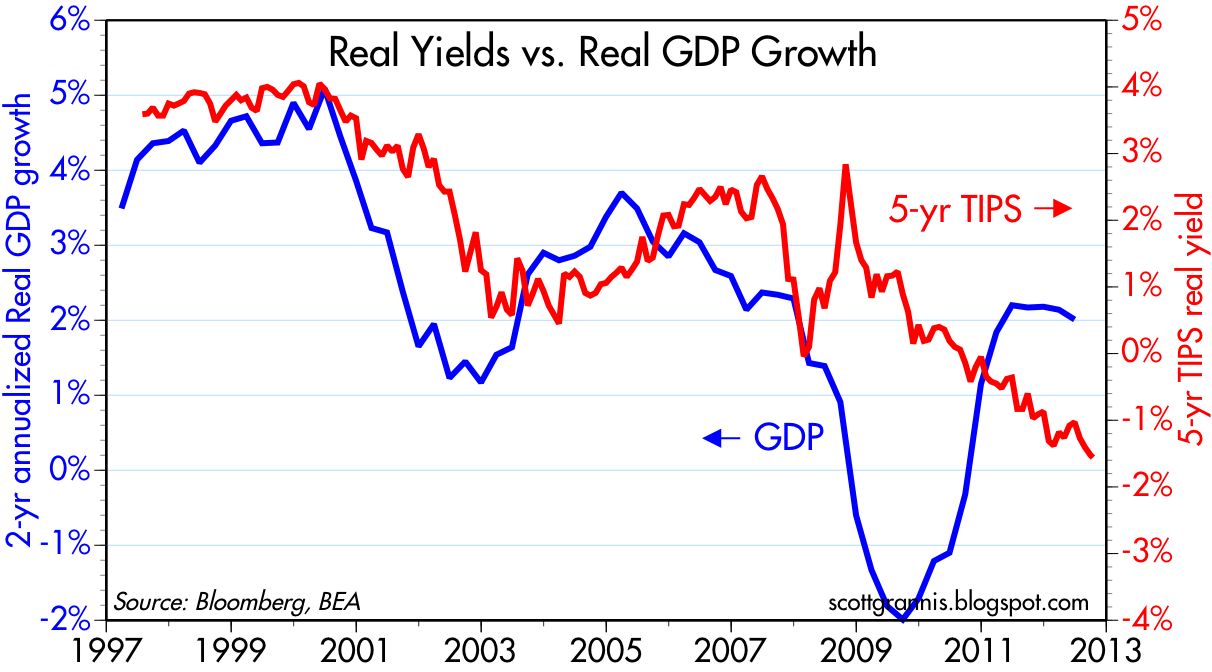
Negative real yields imply dismal growth expectations. Despite the evidence of improvement in key financial indicators (e.g., low swap spreads, a steep yield curve, negative interest rates), the market's expectations for growth remain dismal. The above chart shows that there is a tendency for real yields on TIPS to track the real growth rate of the economy. This is only common sense. When the economy was growing very strongly in the late 1990s and early 2000s, the real yield on TIPS was extremely high. TIPS in effect had to compete with the widespread perception that real yields on just about everything were likely to be strong. Today it's just the opposite. Negative real yields on TIPS are a sign that the market expects real economic growth to be very weak. Investors are willing to sacrifice some of their future purchasing power (by locking in negative real yields on TIPS) because they fear that returns on alternative investments could be far worse. The chart above suggests that the economic growth expectations embedded in TIPS prices could be as low as zero for the next several years.

Credit spreads are still elevated. Credit default spreads on investment grade and high-yield corporate bonds are still substantially higher than they were prior to the onset of the last recession. Even though default rates have fallen significantly and the economy has been growing for the past three years, and key indicators of systemic risk are looking very encouraging, the market is still very worried about the future.

Major bear markets leave investors shell-shocked for years. The two major bear markets in our lifetimes—from the mid-1960s to the early 1980s, and from the early 2000s to the late 2000s—resulted in equity prices falling by roughly two-thirds in real terms. As the saying goes, "once burned, twice shy." Market participants are still very afraid of getting back into the market, worrying instead that another sell-off could be just around the corner. As they say, "bull markets climb walls of worry." It is only natural for markets to still be very worried about the future. There are no obvious signs of excessive optimism to be found these days. Rather, it's much easier to find signs of pessimism.

PE ratios are below average. Continued concerns about the future are also reflected in the trailing PE ratio of the S&P 500, which is below its long-term average. The market was exceedingly optimistic in 2000, when PE ratios soared to 30, but today pessimism is the default position. The market is reluctant to trust that profits will continue growing, or even maintain current levels.


Equity yields tower over corporate bond yields. despite record profits. Normally, the earnings yields on stocks is lower than the yield on corporate bonds. That's because equity investors are usually willing to give up some yield in exchange for the expectation of future capital gains. Today, however, the earnings yield on stocks is much higher than the typical yield on corporate bonds. This can only mean that the market is very worried that earnings will fall in coming years—perhaps falling in mean-reverting fashion to 6% of GDP or thereabouts—and thus prefers to own corporate bonds at a much lower yield because they are higher in the capital structure and thus more immune to adversity.

In a global context, profits look sustainable. While it's very tempting to look at profits as a % of U.S. GDP and conclude that they are so high they can only fall by a lot, the above chart suggests that profits as a % of global GDP are not very high at all and could be quite sustainable at current levels. The U.S. economy has become so much more internationalized that it is a mistake, I believe, to confine one's analysis to the U.S. economy. Companies today (e.g., Apple) are able to address global markets that are growing by leaps and bounds. It is not at all unreasonable to find that corporate profits have also been growing at a much faster rate than the U.S. economy, and there is little reason to suspect that this will change any time soon. Even if corporate profits stopped growing, PE ratios would still be low by historical standards, and very low in the context of extremely low Treasury yields.
Next installment: Monetary Policy
Tidak ada komentar:
Posting Komentar